
Yoga teacher website design and brand image: from zero to page one
Web Design · Brand Identity · Copywriting · SEO
Case of study
Wellness website that attracts clients: A look inside the project
The context: A yoga instructor with real clients and no digital presence
Deyanira is a certified yoga instructor based in Caracas. She also offers sophrologie sessions, a therapeutic approach that is largely unknown in Venezuela.
Her methodology is deeply personal. She works with a wide range of clients including professionals dealing with chronic stress, older adults and people in recovery, and that capacity to adapt is her most authentic differentiator.
When we started working together, Deyanira had real clients from her in-person services and wanted to grow her business by offering online classes to international clients. What she didn’t have was any digital presence: no website, no visual brand, no way for a new client to find her, understand what she offers, or reach out with confidence.
She needed a yoga teacher website design built around her context.
The challenge
This project called for building a brand identity from scratch and then translating it into a yoga teacher website that would work as a real client acquisition tool, not just a digital business card.
Three specific challenges shaped every decision along the way.
The first was the market context. Venezuela’s economic reality means that online payment isn’t accessible to a large part of the local audience, but it’s essential for international clients. The system needed to work for both.
On top of that, WhatsApp is the primary channel for contact and sales across most service businesses in Venezuela, so the website had to be designed around that reality, not in spite of it.
The third challenge was sophrology itself. Most of Deyanira’s potential clients have never heard of it. The site needed to introduce it without overwhelming, spark curiosity without confusing, and create an emotional connection with the reader before they even fully understood what it was.
The brand identity for a yoga instructor personal brand
After defining Deyanira’s values and essence as an instructor, three clear pillars emerged: connection, adaptability, and calm. Not the decorative calm of generic wellness brands, but the kind that shows up when someone feels truly supported.
The logo mark depicts two elephants facing each other, trunks intertwined in a gesture of love and care. The image can also be read as a single elephant seen from the front. That double reading is intentional: it reflects the duality at the heart of Deyanira’s practice, the meeting between instructor and student, and at the same time each person’s encounter with themselves.
The elephant carries deep symbolic weight in yoga traditions, associated with wisdom, strength and patience, but it also holds personal meaning for Deyanira: it’s her favorite animal. That detail matters. A brand rooted in something genuine communicates it effortlessly.
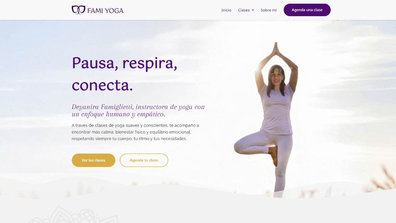
The palette combines warm violets and golden tones that convey warmth, spirituality and professionalism without falling into the visual clichés of mass-market wellness. The result is a wellness brand identity that feels both approachable and credible, distinctive enough to stand out and cohesive enough to be remembered.
The yoga teacher website design
A conversion-focused wellness website structure
The site’s structure was designed around how Deyanira’s potential clients make decisions.
The narrative of the home page follows an emotional-first conversion logic: The visitor arrives, pauses, and immediately feels seen. Then they discover how they can practice, the concrete benefits for their body and mind, who Deyanira is and why her approach is different.
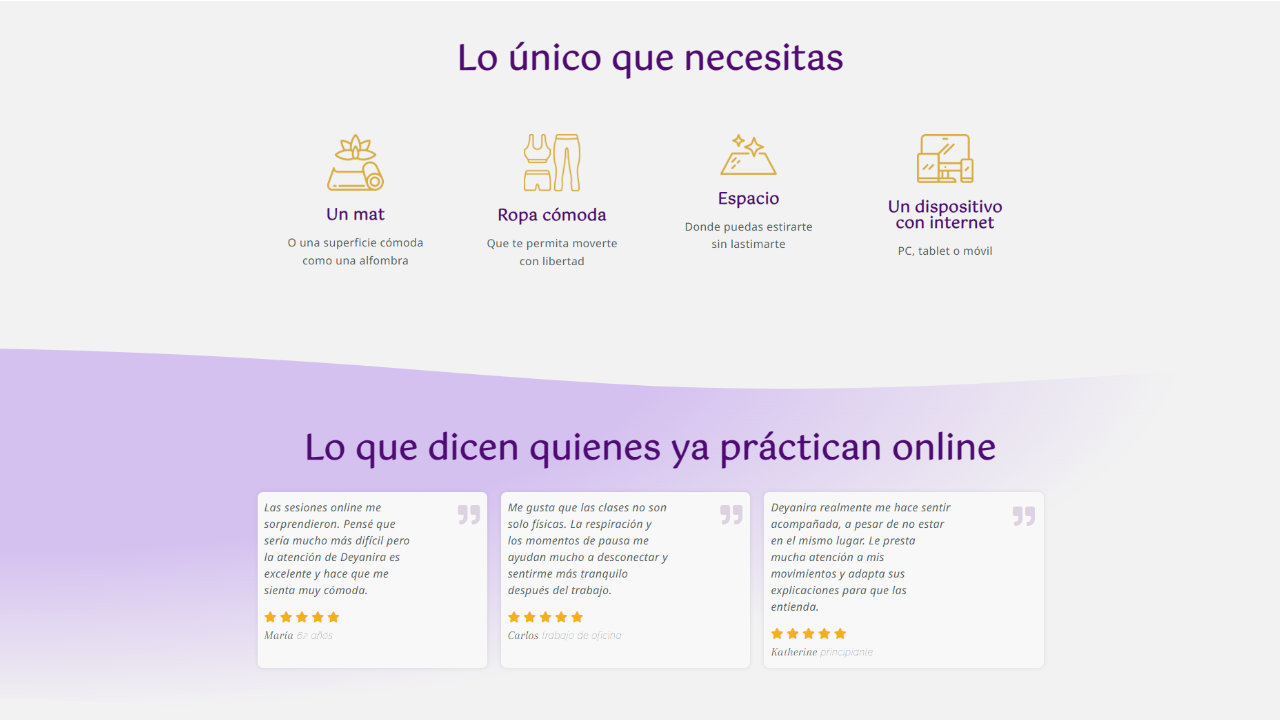
Finally they hear it confirmed by real students who’ve already taken that step. Certifications close the trust arc just before the final call to action, so by the time the visitor reaches it they feel reasured.
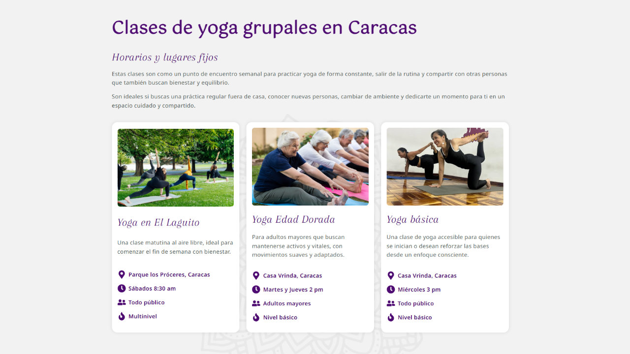
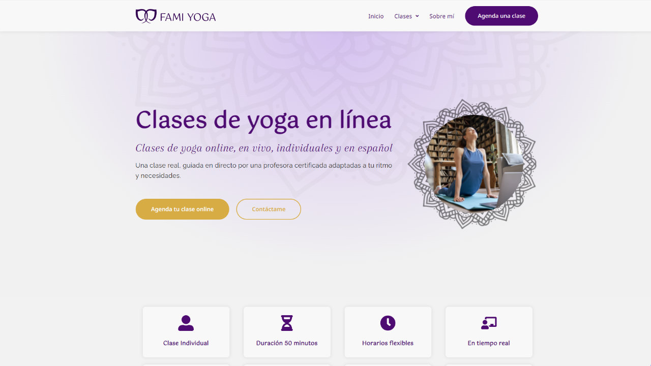
Each page has its own role in the conversion journey, and nothing is accidental. The CTAs appear consistently throughout the pages so the visitor can act the moment they’re ready, without having to scroll to find a way in.
This is the same strategic thinking I bring to every yoga teacher website design I work on: a structure that guides the visitor with intention, builds trust progressively, and makes it easy for the right clients to take the next step.
Designed for mobile first
Statistics show that people looking for yoga or wellness classes almost always do so on their phones, particularly in their free time or while waiting somewhere, and often decide right then and there whether or not to get in touch.
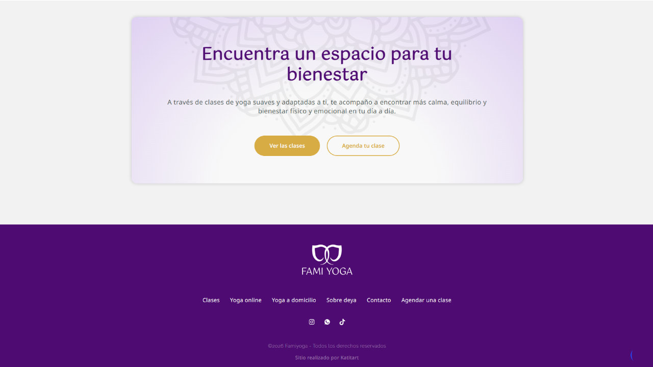
With that in mind, I designed the site with the mobile screen as my top priority. I wanted the text to be easy to read. I wanted the contact buttons to be where the thumb naturally lands. I wanted booking a class or opening WhatsApp to take just seconds, without having to search or scroll too much.
Text written to connect and to be found
The site’s text is written to sound like a natural conversation with Deyanira about her work, her clients, and the way she explains what she does. The result is a more human site that conveys approachability and warmth, addressing real questions with the tone of someone who already understands her clients’ concerns because she has heard them many times.
In addition, the text on each page naturally incorporates strategic phrases such as “in-home yoga classes in Caracas” or “online yoga in Spanish” that can be used by clients who don’t know Deyanira, which helps ensure that the Famiyoga website appears in clients’ Google searches.
Booking alternatives for each customer profile
Deyanira has two types of customers with different needs: those who prefer to use WhatsApp for all their transactions, and those who contact her from abroad and are accustomed to booking and paying on their own.
The solution was to create two parallel pathways that coexist seamlessly. On one hand, for clients who prefer to handle everything on their own, the booking system allows them to schedule and pay completely independently, at any time and from anywhere, while also offering the ability to easily sync classes with both the instructor’s and the client’s calendars.
And for those who have difficulty with online payment, the FAQ section makes it clear from the start that there’s always an alternative via bank transfer or cash payment. To facilitate this, contact buttons are available throughout the site that connect directly to WhatsApp with a pre-filled message ready to send, offering a communication channel that feels more personal and accessible.
Both paths lead to the same goal: booking a class, but each respects the way each client wants to get there.
The results: Yoga website design that ranks on Google
Famiyoga went from having no digital presence to having a complete, conversion-focused wellness website with a cohesive system: brand identity, strategic structure, and content built to attract the right clients and turn visits into bookings.
The site ranks on the first page of Google for searches like “yoga classes at home in Caracas”, which means Deyanira competes with real visibility against established studios without depending entirely on social media to be found.
Working on this project reinforced something that shapes how I approach every movement and wellness studio website I design. Understanding the real context of a client’s market, how their customers communicate, how they pay and where they search, is just as important as any visual decision.
A wellness website design that considers its client’s context from the start is the difference between a site that looks good but costs more than it brings in, and a site that actively turns visitors into customers.
The context: A yoga instructor with real clients and no digital presence
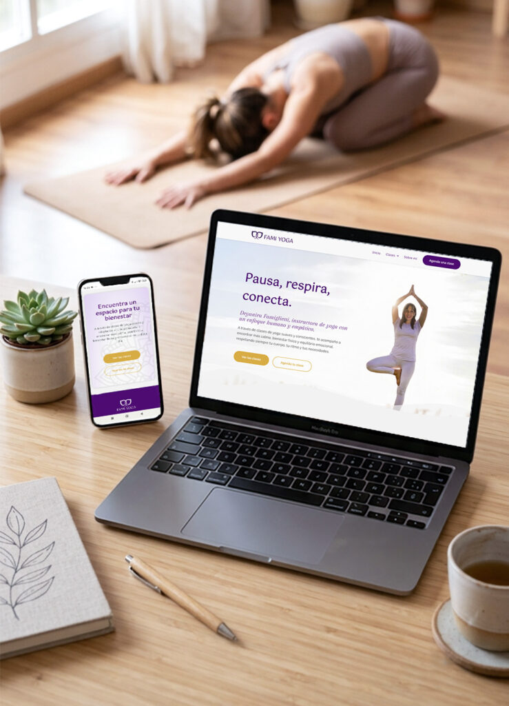
Deyanira is a certified yoga instructor based in Caracas. She also offers sophrologie sessions, a therapeutic approach that is largely unknown in Venezuela.
Her methodology is deeply personal. She works with a wide range of clients including professionals dealing with chronic stress, older adults and people in recovery, and that capacity to adapt is her most authentic differentiator.
When we started working together, Deyanira had real clients from her in-person services and wanted to grow her business by offering online classes to international clients. What she didn’t have was any digital presence: no website, no visual brand, no way for a new client to find her, understand what she offers, or reach out with confidence.
She needed a yoga teacher website design built around her context.
The challenge
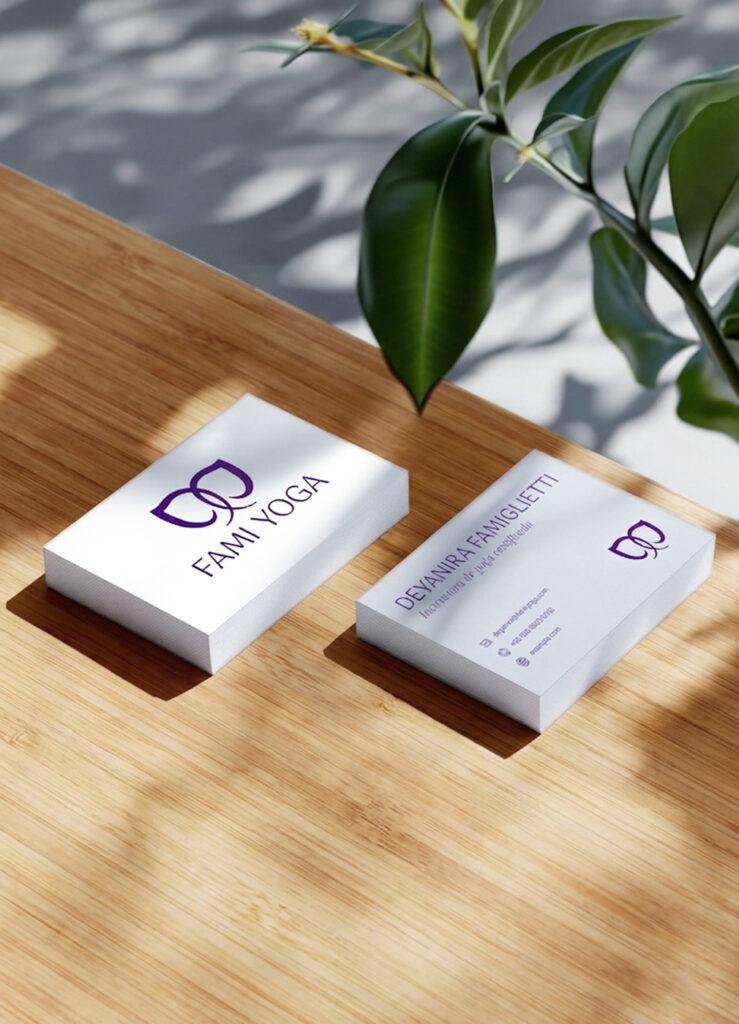
This project called for building a brand identity from scratch and then translating it into a yoga teacher website that would work as a real client acquisition tool, not just a digital business card.
Three specific challenges shaped every decision along the way.
The first was the market context. Venezuela’s economic reality means that online payment isn’t accessible to a large part of the local audience, but it’s essential for international clients. The system needed to work for both.
On top of that, WhatsApp is the primary channel for contact and sales across most service businesses in Venezuela, so the website had to be designed around that reality, not in spite of it.
The third challenge was sophrology itself. Most of Deyanira’s potential clients have never heard of it. The site needed to introduce it without overwhelming, spark curiosity without confusing, and create an emotional connection with the reader before they even fully understood what it was.
The brand identity for a yoga instructor personal brand
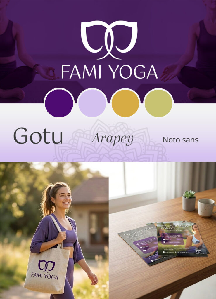
After defining Deyanira’s values and essence as an instructor, three clear pillars emerged: connection, adaptability, and calm. Not the decorative calm of generic wellness brands, but the kind that shows up when someone feels truly supported.
The logo mark depicts two elephants facing each other, trunks intertwined in a gesture of love and care. The image can also be read as a single elephant seen from the front. That double reading is intentional: it reflects the duality at the heart of Deyanira’s practice, the meeting between instructor and student, and at the same time each person’s encounter with themselves.
The elephant carries deep symbolic weight in yoga traditions, associated with wisdom, strength and patience, but it also holds personal meaning for Deyanira: it’s her favorite animal. That detail matters. A brand rooted in something genuine communicates it effortlessly.
The palette combines warm violets and golden tones that convey warmth, spirituality and professionalism without falling into the visual clichés of mass-market wellness. The result is a wellness brand identity that feels both approachable and credible, distinctive enough to stand out and cohesive enough to be remembered.
The yoga teacher website design
A conversion-focused wellness website structure
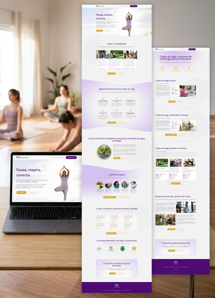
The site’s structure was designed around how Deyanira’s potential clients make decisions.
The narrative of the home page follows an emotional-first conversion logic: The visitor arrives, pauses, and immediately feels seen. Then they discover how they can practice, the concrete benefits for their body and mind, who Deyanira is and why her approach is different.
Finally they hear it confirmed by real students who’ve already taken that step. Certifications close the trust arc just before the final call to action, so by the time the visitor reaches it they feel reasured.
Each page has its own role in the conversion journey, and nothing is accidental. The CTAs appear consistently throughout the pages so the visitor can act the moment they’re ready, without having to scroll to find a way in.
This is the same strategic thinking I bring to every yoga teacher website design I work on: a structure that guides the visitor with intention, builds trust progressively, and makes it easy for the right clients to take the next step.
Designed for mobile first
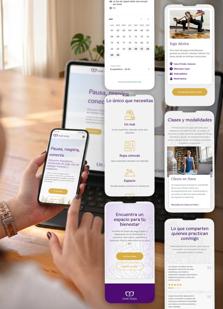
Statistics show that people looking for yoga or wellness classes almost always do so on their phones, particularly in their free time or while waiting somewhere, and often decide right then and there whether or not to get in touch.
With that in mind, I designed the site with the mobile screen as my top priority. I wanted the text to be easy to read. I wanted the contact buttons to be where the thumb naturally lands. I wanted booking a class or opening WhatsApp to take just seconds, without having to search or scroll too much.
Text written to connect and to be found
The site’s text is written to sound like a natural conversation with Deyanira about her work, her clients, and the way she explains what she does. The result is a more human site that conveys approachability and warmth, addressing real questions with the tone of someone who already understands her clients’ concerns because she has heard them many times.
In addition, the text on each page naturally incorporates strategic phrases such as “in-home yoga classes in Caracas” or “online yoga in Spanish” that can be used by clients who don’t know Deyanira, which helps ensure that the Famiyoga website appears in clients’ Google searches.
Booking alternatives for each customer profile
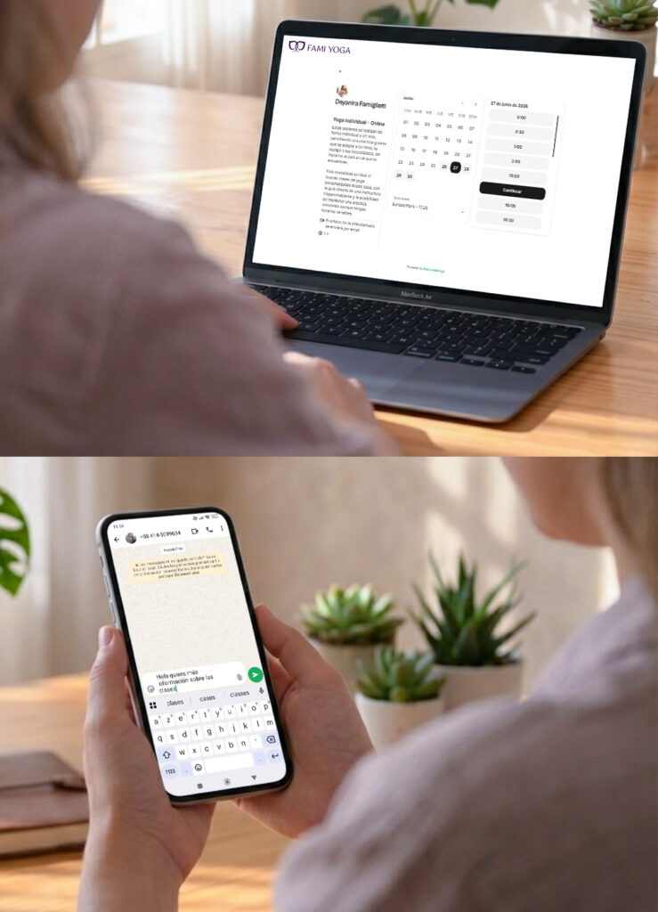
Deyanira has two types of customers with different needs: those who prefer to use WhatsApp for all their transactions, and those who contact her from abroad and are accustomed to booking and paying on their own.
The solution was to create two parallel pathways that coexist seamlessly. On one hand, for clients who prefer to handle everything on their own, the booking system allows them to schedule and pay completely independently, at any time and from anywhere, while also offering the ability to easily sync classes with both the instructor’s and the client’s calendars.
And for those who have difficulty with online payment, the FAQ section makes it clear from the start that there’s always an alternative via bank transfer or cash payment. To facilitate this, contact buttons are available throughout the site that connect directly to WhatsApp with a pre-filled message ready to send, offering a communication channel that feels more personal and accessible.
Both paths lead to the same goal: booking a class, but each respects the way each client wants to get there.
The results: Yoga website design that ranks on Google
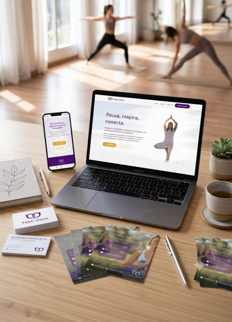
Famiyoga went from having no digital presence to having a complete, conversion-focused wellness website with a cohesive system: brand identity, strategic structure, and content built to attract the right clients and turn visits into bookings.
The site ranks on the first page of Google for searches like “yoga classes at home in Caracas”, which means Deyanira competes with real visibility against established studios without depending entirely on social media to be found.
Working on this project reinforced something that shapes how I approach every movement and wellness studio website I design. Understanding the real context of a client’s market, how their customers communicate, how they pay and where they search, is just as important as any visual decision.
A wellness website design that considers its client’s context from the start is the difference between a site that looks good but costs more than it brings in, and a site that actively turns visitors into customers.
See it live
Check out the website Deyanira uses to attract customers every day.
Explore this yoga teacher website design and picture what this level of strategy could look like for your own brand.
Testimonial
What the client says about her new wellness website design
“The brand design Katherine created for me deeply connects with my feelings, my emotions, and what I teach,
she managed to capture my essence and my purpose in a beautiful way.
As for the website, it is simply wonderful. When I first saw it, I was drawn to its attractive design and colors, and how well-structured it was. It’s very easy to navigate and I believe it’s perfect even for people who aren’t familiar with technology.
I highly recommend Katherine, as she has a natural talent and remarkable ability to grasp the essence and intention behind what you envision for your project.”


Deyanira Famiglietti
Yoga instructor – Famiyoga
Your business’s next chapter
Let's build something great together
Ready to turn your yoga or wellness website into your most powerful business tool? Let’s have a free discovery call to talk about your project and how strategic web design can help you achieve your goals.